Premium Graphic Tee Review: What Quality Means
A graphic tee has only a few seconds to make its case. The image catches the eye, but the fabric, fit, and conviction behind the design decide whether it becomes a shirt you reach for repeatedly or one that disappears into a drawer. This premium graphic tee review looks beyond the first impression and asks what makes a men’s graphic T-shirt genuinely worth wearing.
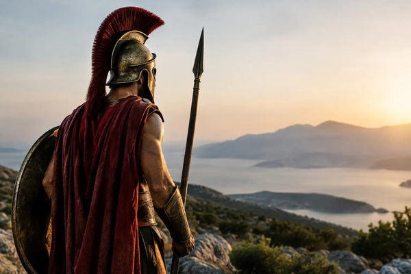
For men drawn to mythology, Stoicism, ancient history, and symbols of strength, the standard should be higher than a recognizable reference printed on cotton. A premium tee should feel considered from collar to hem. It should carry an idea without turning the wearer into a billboard.
What a Premium Graphic Tee Should Deliver
Premium is often used as a shortcut for a higher price. It should mean more than that. In a well-made graphic tee, quality is a complete system: the weight and hand of the fabric, the shape after washing, the clarity of the print, and the intelligence of the artwork all reinforce one another.
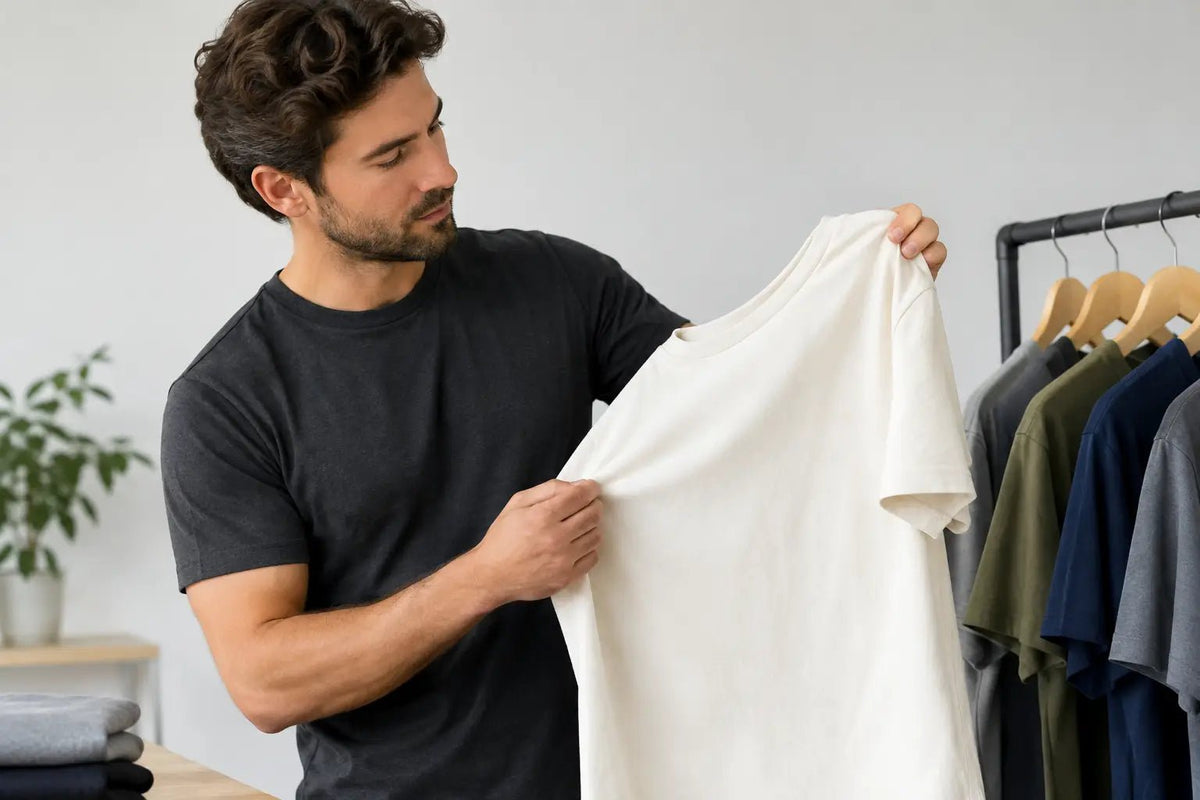
Start with the shirt itself. A lightweight blank can be comfortable in heat, but it may also twist, cling, or lose its structure quickly. Heavier cotton is not automatically superior, either. The better test is balance. The fabric should have enough substance to drape cleanly over the shoulders and chest, while remaining breathable enough for daily wear. A shirt that feels stiff and armored may look substantial on a hanger but rarely earns a permanent place in rotation.
The neckline matters more than most buyers expect. A weak collar is one of the fastest signals that a tee was built for a short life. Look for a collar that sits flat, holds its shape, and frames the neck without choking it. Clean shoulder seams and a stable side construction matter for the same reason: they keep the garment from looking tired before the design has had time to develop character.
Fit is personal, but it should be intentional. A classic fit gives the artwork room and works across more body types. A tailored fit can look sharper, provided it does not pull across the chest or shorten excessively after laundering. Oversized cuts have their place, especially with bolder back graphics or streetwear-oriented art, but they can dilute a design meant to feel precise and symbolic. The right silhouette depends on how you dress. The requirement is that the shirt looks deliberate rather than accidental.
Premium Graphic Tee Review: The Print Test
A graphic can be historically rich and still fail if the execution is poor. Thick, plastic-like ink is uncomfortable in warm weather and can crack after a handful of washes. Fuzzy linework turns an intricate symbol into visual noise. Colors that look vivid on a product page but fade immediately are not a mark of character. They are a quality problem.
The strongest prints preserve detail while working with the fabric, not sitting on top of it like a decal. Fine engraving, battle-worn stone texture, or a restrained ancient coin motif should remain legible at close range. Large artwork should have a clear visual hierarchy, so the eye knows where to land first. This is especially important for designs rooted in mythology or philosophy, where every element can carry meaning.
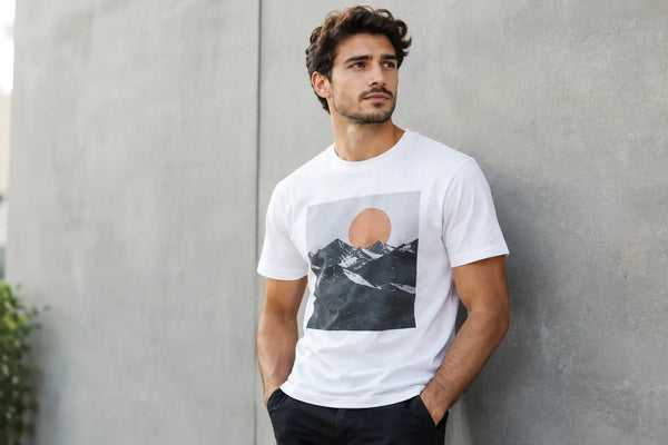
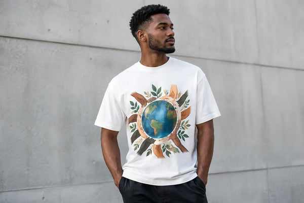
Placement is part of the artwork. A centered chest print remains the most versatile option because it is easy to wear under an overshirt, jacket, or open flannel. A small left-chest emblem can feel more understated and works well when the full narrative appears on the back. Full-front designs make a stronger statement, but they demand discipline. If every inch of the shirt is competing for attention, the message loses force.
Do not confuse distressing with poor printing. Intentional weathering can give a Spartan helmet, Roman eagle, or meditative Stoic phrase a sense of age. The difference is control. Purposeful distressing supports the mood of the design; uneven ink, muddied details, and premature cracking simply reveal weak production.
Meaning Is the Difference Between Art and Merch
The market is crowded with generic wolves, skulls, swords, and slogans about discipline. None of those subjects are inherently weak. Their power depends on context. A symbol becomes memorable when it belongs to a larger story.
Consider the Medusa. Reduced to a decorative face, she is only an image. Treated with awareness of her place in Greek myth, she can become a meditation on protection, fear, violation, and the gaze. The same is true of the laurel wreath, the owl of Athena, the labyrinth, the Roman standard, or the Stoic idea of amor fati. A meaningful design does not need a museum label attached to it, but it should reward the man who knows the reference and invite curiosity from the man who does not.
This is where premium graphic apparel separates itself from novelty clothing. The aim is not to announce that you like ancient Greece or quote Marcus Aurelius as loudly as possible. It is to wear an image that carries a principle: courage under pressure, command of the self, resistance to chaos, remembrance of mortality, or the patience to endure.
Hilt & Stone approaches this territory through original artwork built around myth, history, symbolism, and self-mastery. That distinction matters because apparel with meaning should have the same degree of authorship as the ideas it represents. A borrowed clip-art helmet and a line of motivational text cannot carry the weight of a timeless subject.
How It Holds Up After the First Week
The honest review of any tee begins after it has been washed. Before wearing a new shirt, check the care label and assume that heat is the enemy of both cotton fibers and printed artwork. Cold water, a gentle cycle, turning the shirt inside out, and low heat or air drying will extend its life. That is not special treatment. It is basic maintenance for a garment you want to keep looking sharp.
Still, care cannot rescue a poorly made shirt. After several washes, evaluate three things: shrinkage, collar recovery, and print integrity. Some cotton shrinkage is normal, particularly if the garment has not been preshrunk. What is not acceptable is a tee that becomes noticeably shorter, develops a corkscrew side seam, or loses its neckline after minimal wear.
A good premium shirt should also age with dignity. Cotton softens. Black can mellow slightly. A print may settle into the fabric. These changes can add character when the base garment and artwork are sound. The goal is not for the shirt to look factory-new forever. The goal is for it to look better lived in, not worn out.
Who Should Spend More on a Graphic Tee?
Paying more makes sense if the design reflects something you actually value and the garment fills a real role in your wardrobe. A meaningful black tee with a disciplined graphic can work with denim, fatigue pants, boots, sneakers, or under a textured overshirt. It has more range than a loud trend piece worn once for a photo.
It may not make sense if you want disposable variety or only wear graphic tees for workouts and yard work. In that case, basic cotton shirts are practical. Premium apparel earns its price through repeated use, visual substance, and construction that keeps pace with the idea on the chest.
Before buying, ask a simple question: would you still wear this if nobody asked about it? If the answer is yes, the design has likely moved beyond novelty. It has become part of your uniform.
A great graphic tee does not need to shout. It should sit on the body with confidence, carry a symbol with clarity, and remind you of a standard worth keeping when the day gets difficult.